In what ways does your media product use, develop or challenge forms and conventions of real media products?
One way that my media product uses conventions of real media is through good wins theory. His eight characteristics are all used in my music video.
1. Music videos demonstrate genre characteristics
(e.g. stage performance in metal video, dance routine for boy/girl band).
One characteristic of this genre is to have the main focus of the music video on the artist as shown in my research into the genre characteristics of contemporary R & B.
2. There is a relationship between lyrics and visuals (either illustrative, amplifying, contradicting).
One example of this would be when a text message appears, with the lyrics as the text. This then provides a relationship with the lyrics and visuals
3. There is a relationship between music and visuals
(either illustrative, amplifying, contradicting).
An example of this would be when the music becomes more up-beat, the camera pans around the artist quickly and so the speed of the pan anchors the music.
4. The demands of the record label will include the need for lots of close ups of the artist and the artist may develop motifs which recur across their work (a visual style).
The artist is the main focus of the music video and so this characteristic has been used.
5. There is frequently reference to notion of looking (screens within screens, telescopes, etc) and particularly voyeuristic treatment of the female body.
An example of this would be when the artist is reminiscing a previous relationship, by looking at old photos of it.
6. There is often intertextual reference (to films, TV programmes, other music videos etc).
An example of this would be when the artist is seen with a girl, which would be stereotypical of romantic films and so shows intertextual references.
Another theory would be Todorovs narrative theory.
1. State of equilibrium: Artist is in a relationship
3. Recognition of disruption of equilibrium: Artist is in the park reminiscing on the relationship
4. Attempt to restore equilibrium: Artist is drinking and then attempts to replace ex girlfriend with another girl. This does not work however and he instead attempts to meet up with his ex girlfriend
5. Restoration to new equilibrium: Artist sees ex girlfriend and music video fades out
How effective is the combination of your main product and ancillary texts?
The song that I chose to do for my music video was Drunk by Ed Sheeran.
This track is originally aimed at ages 16-24 and so my music video had to accompany this in order to fit with the track. In addition to this however, the ancillary texts had to do the same job.
 The main task of the ancillary texts then was to anchor the main product in cementing the artist image and helping to promote the artist. The ancillary texts that I used in order to achieve this were a digipak and a magazine advert.
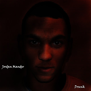
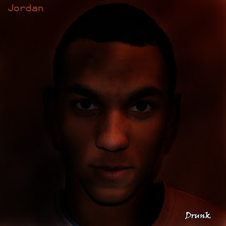
It is easy to see immediately that both the magazine advert support each other and this is anchored by the use of the same image in both texts. Another link between the two is the font used for both the artist name (digipak) and the release date (advert). However I did not want to make the two exactly the same, and so the other text is different, to add a sense of enigma to the track.
In addition to creating a strong link with the two ancillary texts, I aimed to create synergy with other well known brands. I did this on the advert with iTunes, HMV and play.com, allowing the audience to see that the artist is prestigious, or aiming to be.
The digipak was made first, and was designed to accompany the artist image portrayed in the music video. This was done as the artist is largely focused on during the music video, as is the case in the digipak. The digipak further enhances the artist by using a monochrome colour scheme (brown). This is due to the colour of the artist and so it anchors the artist well. The dull locations of the music video also do this in that the artist is often seen in the centre of the shot, with minimal activity around him. In this way then they both heighten the prestige of the artist.
The advert also achieves the same goal as the digipak. The same image means that the artist is again portrayed with monochromatic colours and so enhances the artist. The image used however is larger than in the digipak, meaning that it anchors the artist image more than the digipak.
Both pieces then anchor the artist image, in similar ways due to the repeated use of the image, but in different ways due to the sizes and the exact colour scheme used.
However it may also be said that they do not fully anchor the artist. The artist is shown primarily in mid-shots throughout the piece, however the advert and digipak are close ups. This may then mean that the ancillary texts are not immediately identifiable with the music video. As digipaks and adverts are generally only briefly seen, not being to immediately relate the two would mean that they would not have achieved the intended task. There is then room for improvement, maybe through closer shots being used in the music video, or another image for the ancillary pieces that is closer to a mid shot.
Overall however I do feel that the ancillary texts anchor the main product well in that the average viewer would be able to relate the two pieces.
What have you learned from your audience feedback?
Through both youtube commenting and word of mouth I have learnt both what has been good about my music video and what could have been better.
The first youtube comment (pictured left) allowed me to see that the sped up pan around the artist was successful. This effect was used to anchor the increase in tempo in the music at that time. However it is apparent that the scene in which I attempted to match the visuals to the lyrics, was not as well executed as I would have liked. Next time this is attempted, I think that a camera without flash would be better as it would not have reflected off of the phone as it did.
The second comment however, contradicting the first comment, liked the match of the lyrics to the visuals. This may then show that audience perceive texts as individuals and so then would be an example of how different people consume the text differently. A criticism was however that I could have used more varied locations in the piece. This is because the music video was centred around two main locations and then a few additional ones, which was used to keep the video simplistic. However this may not appeal to the masses, so may then be a comment to take on board for the future.
In addition to these comments, I received both positive and negative feedback about the video through word of mouth.
One positive comment was that the artist and the locations used were conventional of the genre of music. This then meant that the audience that it was aimed at were reached. As they could then relate to the locations and costume, it meant that they felt more connected with the video and so enjoyed watching it.
However the fault in rendering through adobe photoshop was mentioned, as the video flashes red twice. However this is not a comment that I could personally act upon due to it being a technological error as opposed to poor editing or choice of shots.
Another positive comment then was that the lip syncing was well executed. I was particularly happy with this comment as there was a lot of lip syncing throughout the text, which meant that there was large scope for error, however it seemed to work well.
The pictures of the ex girlfriend shown at the beginning of the video (as the guy sits on the bench looking at his phone) were said to be too small however. This was because there were too many cramped into the phone, which made it hard to make out what was actually in the photo. A suggestion was made that instead of a collection of photos, one bigger one may have been more effective in portraying the scene better to the audience.
A final comment was that the storyline was hard to interpret. As the lyrics do not fully anchor the music video, it was said that it was hard to follow exactly what was going on. This was due to the multiple girls appearing in the text, confusing the viewer as to who the ex was and who the friend was. To take this on board then, a better way to approach another task similar to this, would be to follow the lyrics closer, to allow the text to be portrayed in the way that is wanted by the producer.
How did you use media technologies in the construction and research, planning and evaluation stages?
Youtube was used in the distribution of the music video, as it was how the video was released.How did you use media technologies in the construction and research, planning and evaluation stages?
Youtube was also used in the research as I used it to see the music videos that currently existed, with the same genre of music to the music I was to use.
Google was used primarily in the research of the task, as I used it to research the genre of the music and other similar texts.
Facebook was used in the promotion of the music video, as a link being shared allowed various people to see the video on youtube.
For the evaluation, blog posts were used, as it allowed me to use new media, as a video evaluation would have used youtube to be able to distribute it.
Mobile phones were also used in the planning of the music video as a means of communication, to allow me to get into contact with my actors.
Adobe Premiere pro was a new program that was used in the construction of the music video, as I used this to edit the video itself
Adobe photoshop was also used in the construction of the ancillary texts, as images were manipulated and text added.


