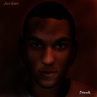
To see how to make my own digi-pak, I looked at ones that were already on the market.
The first was Adele - 21
This album was made up of mostly the image of the artist, but was also made up of the artist name and album title. Apart from that, the cover had nothing else. The colour scheme used then was symbolic of the album, the light colours I feel represented the smooth tone of the album.
The second was Ed Sheeran - +
The album was again mostly made of the artist image, it was then accompanied by the album name. It did not however feature the artist name, but the colour scheme instead was representative of the artist, as he is associated with his ginger hair, the colour scheme is predominantly orange.
The last album was Jessie J - Who you are
As the others, this cover had the artist image and name, along with the album title. This album however also had a parental advisory tag, to imply that the album may not be suitable for children to listen to alone. The colour scheme here however is black and white, which is plain and so may show that the artist is only focused on her and her music as opposed to persona.
Common Characteristics:
- Large artist image
- Artist name
- Album title
- Colour scheme representative of the music or the artist
When creating my digi-pak, I used the common characteristics of large artist image, artist name, album title and the colour scheme was representative of my artist. Originally, I had many effects on on idea and did not know which to pick, I therefore asked friends family and peers to pick a favourite cover.
The artwork that was preffered was the last of the bunch, and with a few ideas such as a shorter artist name, repositioning of the artist name and a change in colour turned the front cover into:
After that I decided to work on the back of the digipak. I had two ideas and made both, I then asked again which one was preffered of the two:
The second photo was preffered and so the back cover was chosen to be:
Next was the inside of the digipak, I had the idea just to put the lyrics on the left cover and chose to put alcohol on the right to anchor the title of the song. I came up with these two ideas:
The right side was liked and so nothing needed to be changed on that, it therefore stayed as:
For the lyrics however, he background was commented on as being 'too light' and the colour of the font was suggested that it would be better if 'it matched the reds and blues of the Antiguan Rum on the right hand cover': I then made another mock up based on these comments:
After re-analysing it, feedback was given that suggested that the background was too dark and the writing should instead be white to match the title of the song on the front cover. After taking this into consideration and the feedback being good about the last draft, the back cover was decided upon to look as such:
After all of these side of the digipak were decided upon, I put all of them together and filled in the spine. The result was:


